
Jake Sannes
The Architecture of a Brand: How Design Systems Are Actually Built
When you think of a brand, what comes to mind first?
The logo?
The colors?
A commercial you have seen a hundred times?
Or the way it makes you feel?
Most designers default to the logo. It feels like the centerpiece, the crown jewel. And yes, it matters. A logo is a critical part of a brand’s identity.
But it is not what makes a brand great.
Twenty years down the line, a logo may become iconic. But as designers, we have to move beyond the thinking that the logo is everything. A logo only works when the brand has structure and when everything operates inside a disciplined visual system.
A brand is not remembered because of its mark.
It is remembered because of its consistency.
The Logo Myth
The industry has quietly adopted a logo-first mentality. As if solving the mark solves the brand.
It does not.
The logo is the final piece of the puzzle, not the foundation.
If the architecture behind it is weak, the logo has nothing to stand on.
A strong brand is built on positioning, messaging, typography, color systems, motion language, usage rules, and communication standards. The logo is simply the signature at the bottom of that system.
When companies panic, they redesign.
When companies lead, they reinforce.
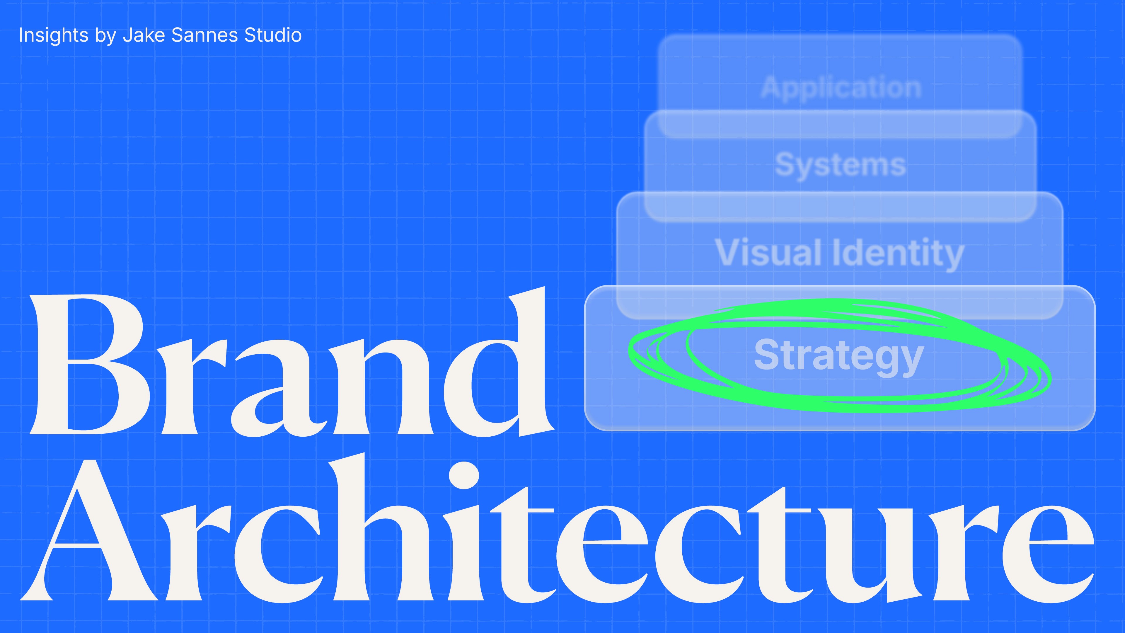
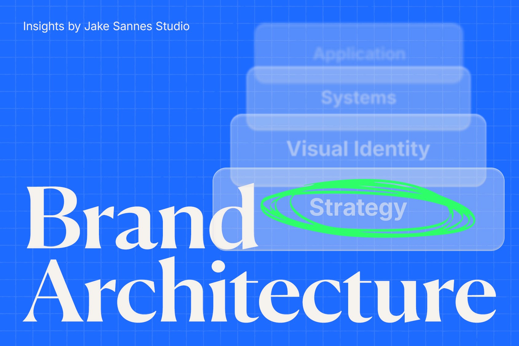
Brand Architecture: The System Behind the Mark
What actually builds brand longevity is architecture.
Brand architecture is the system that governs how a company shows up visually and strategically across every touchpoint. It is the alignment between positioning, messaging, design systems, and documentation.
Everything is working together. Nothing operating alone.
Type.
Color.
Grid systems.
Motion principles.
Photography direction.
Voice and tone.
Application rules.
Case Study: Nike
When these elements operate cohesively, the logo becomes powerful by association, not by design alone.
Nike is often cited as proof of the power of a logo. The Swoosh is one of the most recognizable marks in the world.
But the Swoosh is not why Nike works.
Nike works because of its disciplined visual identity system. The typography. The restraint. The pacing. The clarity of voice. The consistency across decades.
The mark became iconic because the system around it never wavered.
The logo would not hold the same weight without the architecture supporting it.
That is what makes a brand a brand.
Why Companies Panic Rebrand
In today’s culture of constant evolution, brands feel pressure to change before they need to.
Social media accelerates criticism. Trends move quickly. The perception becomes evolve or get left behind.
But change for the sake of movement is not a strategy.
Often, when revenue dips or a crisis surfaces, leadership turns to rebranding as the solution. A new look. A new logo. A visual reset.
If the underlying positioning is unclear, a redesign only masks the issue temporarily.
Strategic positioning is everything.
Once that is compromised, the brand weakens, sometimes beyond repair.
A leak always starts small. Given time, it floods.
Case Study: Cracker Barrel
When Cracker Barrel attempted to modernize its brand positioning, the reaction was immediate.
But the logo was not the real story.
The real story was a shift in identity from nostalgic country-store comfort to something designed to feel more contemporary and appealing to a younger audience.
That is not a logo change.
That is an architectural shift.
Identity shifts require precision, patience, and strategic clarity. If the foundation is not airtight, public reaction can expose the cracks instantly.
The backlash was not just about aesthetics. It was about emotional equity.
That is what people were reacting to.
Strategy Over Aesthetics
Change is difficult. Humans resist it instinctively. When a rebrand is unveiled, the logo becomes the lightning rod for criticism.
It is visible. It is easy to judge.
But strategy should be the first thing examined.
What problem is being solved?
What positioning is being refined?
What system is being strengthened?
A logo is an extension of the brand. It is not the brand itself.
The system behind the logo is the foundation. Without that system, the mark becomes a decoration.
Decoration does not build legacy.
More Like This


" width="1200px"/></svg>)
" width="1200px"/></svg>)