
Jake Sannes
Structure as Strategy
Branding is no longer optional. It defines how companies are perceived, how they grow, and how they endure. Yet the discipline itself is not new. Long before branding became a buzzword, institutions like NASA and IBM understood the power of a cohesive visual system. They invested not in decoration, but in structure.
When NASA introduced its Graphics Standards Manual in 1975, it was an exercise in order. Typography, color, grid systems, and application were defined with precision. The objective was clarity at scale. IBM operated from the same philosophy.
Later, companies like Apple and Google became leaders in brand not because of a logo alone, but because of the system supporting it. They built guidelines that functioned as architecture. A logo may be recognizable, but it is the brand behind it that gives it authority.
Apple is often celebrated for its iconic mark. But its strength lies in the discipline surrounding it. Great branding can also exist when the logo itself is restrained. IBM proves that point.
Identity Is Architecture
The IBM logo is not ornamental. It is not expressive for the sake of expression. Yet it remains one of the most enduring marks in corporate history. When Paul Rand was brought in as a consultant in 1956, IBM was expanding rapidly. Growth exposed fragmentation. Divisions operated with inconsistent typography, marks, and messaging. The company lacked cohesion.
Rand did not simply redesign a logo. He established one of the first comprehensive corporate identity systems in American business history. He refined the mark and, in 1972, introduced the striped version. He developed detailed brand manuals and extended the system across packaging, advertising, collateral, and environmental graphics. This was not visual polish. It was structural alignment.
Clarity Over Novelty
The stripes were not aesthetic embellishment. They suggested speed and modernity while preserving authority. The logo felt technological without being literal. It was clarity, engineered.
What distinguished this work was its strategic grounding. Rand was not pursuing novelty. He was clarifying IBM’s position in the world. Every decision reflected that understanding.
He treated identity like architecture, built on logic, hierarchy, and restraint. And like well built architecture, it endures. More than fifty years later, the striped IBM mark remains. Not as nostalgia, but as proof of disciplined thinking.
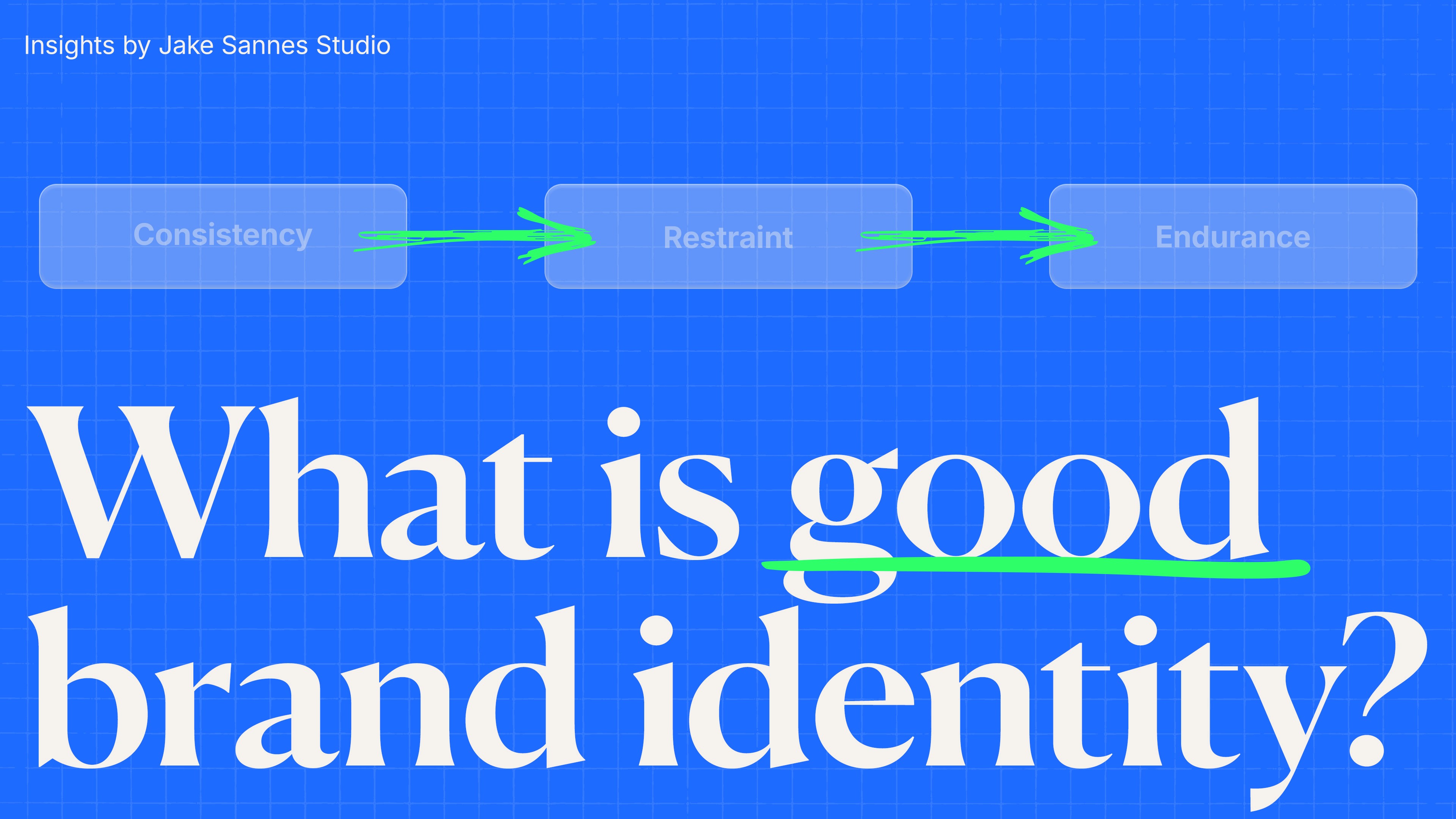
Endurance Is the Measure
A strong brand identity succeeds because it scales. IBM is far larger today than it was in the early 1970s, yet the integrity of the system holds. The same is true of Apple. Their equity was built through consistency, not constant reinvention.
One of the challenges facing brands today is the impulse to change quickly. Digital culture rewards immediacy. But branding is a long term investment. It requires patience. In many cases, it takes decades to fully embed in public consciousness.
Restraint is often the differentiator. Knowing when to evolve matters. Knowing when to protect what works matters more. The power of a brand lies in sustained coherence over time. Branding is not a sprint. It is a long discipline.
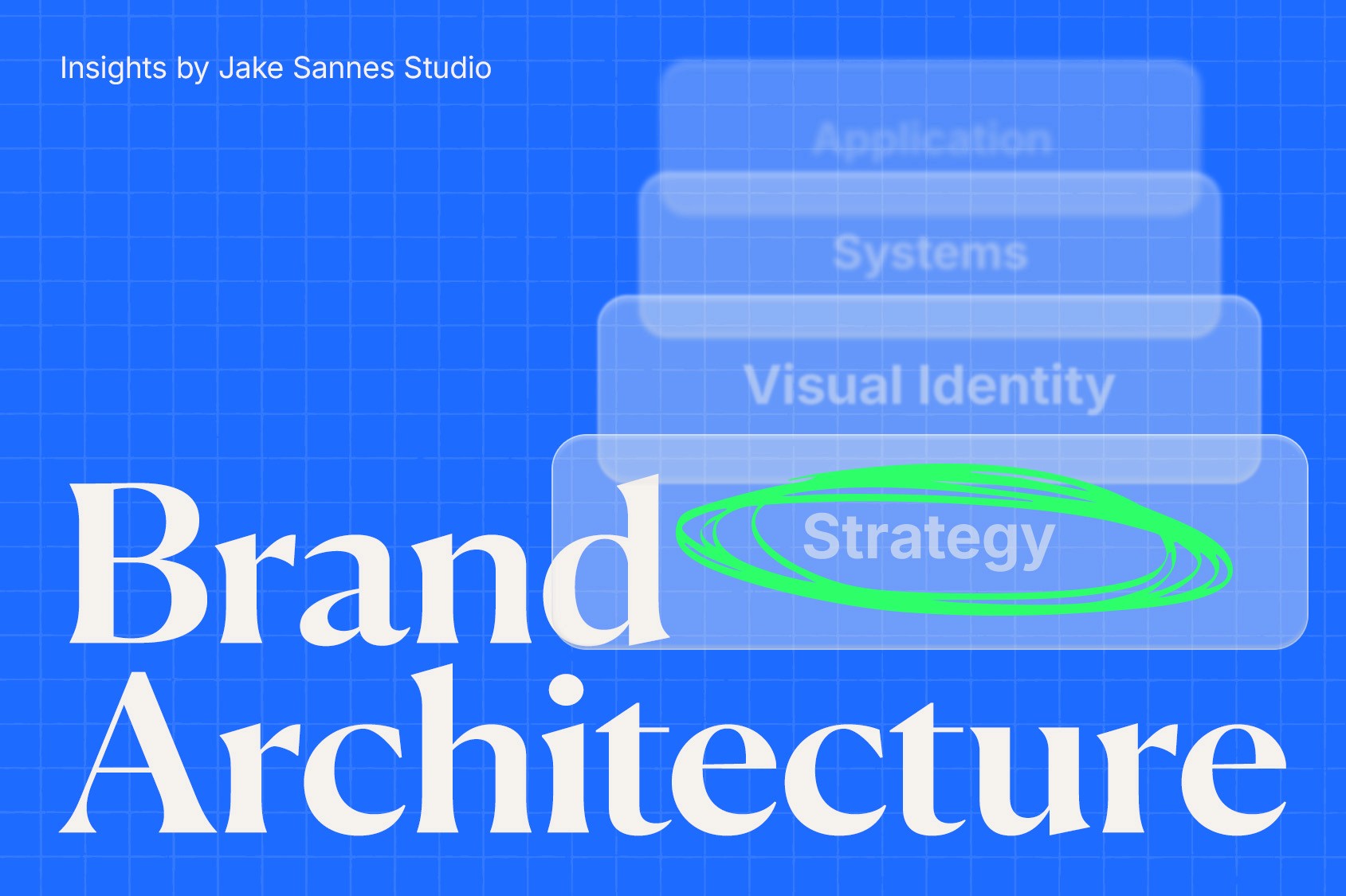
The System Beneath the Logo
Logos are not the substance. They are the signal. The substance is the system beneath them. Treat your brand accordingly, and it may outlast the typical five to twenty year lifecycle of most companies.
If you are evaluating your current visual identity system, Jake Sannes Studio can help identify structural gaps and strengthen the foundation behind your brand. As Paul Rand said, “Design is so simple. That’s why it is so complicated.” Clarity requires discipline. Design is the silent ambassador of your brand.
More Like This


" width="1200px"/></svg>)
" width="1200px"/></svg>)